
How to Choose the Right Colours for your Home: A Comprehensive Guide to Choosing the Right Furniture
Choosing the right colours can be difficult for everyone, even for the most seasoned of interior designers. But when designing your environment, understanding how to effectively blend colours can make all the difference between a room that feels disjointed and one that radiates comfort and cohesion. From selecting a dominant colour that sets the tone to carefully curating furniture, patterns, and accessories, every choice contributes to a unified aesthetic that reflects your unique style. In this comprehensive guide, we will explore the fundamentals of colour theory, how to build a captivating colour palette, and the essentials of choosing the right furniture that complements your vision. By following these principles, you will be empowered to turn your living space into an inviting retreat, perfectly balanced in colour and design. Whether you are an experienced decorator or just starting your journey, this guide aims to inspire and equip you with the knowledge needed to master the art of colour harmony in your home. Let’s embark on this creative adventure together!

Chapter 1: Understanding Colour Theory
Colour theory is the foundation of any successful design project, allowing you to create a visually pleasing environment. At its core, the colour wheel provides essential insights into how colours interact. Complementary colours, which are situated directly opposite each other, offer dynamic contrasts—think blue and orange or red and green. These pairings can evoke energy and vibrancy in a room. Conversely, analogous colours—like blue, teal, and green—contribute to a harmonious aesthetic, creating a calming atmosphere that feels cohesive. To effectively utilize colour theory, familiarize yourself with the colour wheel and experiment with different combinations to find the palette that resonates with your style.
A number of good (and free) software online can help you figure out the different combinations between colours. If you want to try it out and have some fun with it, click on the link down below and it will take you to the Adobe Colour Wheel:
https://color.adobe.com/create/color-wheel

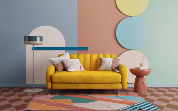
Chapter 2: Choosing Your Dominant Colour
See it as the colour that will drive the rest of your interior's theme. It is the one that can't possibly go unnoticed, such as a green wall and sofa, or a large red rug, or even mustard curtains! The choice is yours. But having one grand colour in mind can make the rest feel easier, as you would have already set the tone and all the rest is there to complement it. And no, white and black don't count.
When contemplating this choice, think about the function of the space. For example, soft pastels may be ideal for a serene bedroom, while bold hues can invigorate a lively living room or home office. Take note on how natural and artificial light affect colour perception—light can soften dark shades, making them more inviting, while bright colours can feel overwhelming without sufficient light. Test paint samples on your walls and observe them at various times throughout the day. In doing so, you'll find the perfect shade that reflects your personality and evokes the desired atmosphere.
Something to keep in mind is that colours impact our mood. Colours like green and brown tend to calm us down, as we evolved to see these colours in nature. Other colours such as blue and yellow can evoke the bright sky, invigorating for a study or a dining room, but not necessarily the best match for a bedroom.

Chapter 3: Building a Colour Palette
Once you've chosen a dominant colour, it's time to develop a colour palette with a secondary and an accent colour. Your secondary colour should complement the primary hue, balancing and enhancing its visual impact. This can be achieved through bold contrasts—like pairing navy blue with soft mustard—or by opting for more subdued shades that create subtle sophistication. Accents, often found in décor or smaller features, add a sense of playfulness and dimension. A well-structured palette enables you to mix and match effortlessly, creating an environment where every piece feels like it belongs. Additionally, be mindful of the proportions in which you use these colours; the dominant colour should take up approximately 60% of the space, the secondary around 30%, and the accent about 10%.

Chapter 4: Selecting the Right Furniture
Choosing furniture aligned with your colour scheme involves both colour and design considerations that harmonize with your established palette. Start by assessing the size and shape of your space—bulky furniture in a small room can feel overwhelming, while sleek pieces can create an airy and open feel. For colour, consider pieces that either echo your dominant and secondary colours or bring in neutrals—greys, whites, or beiges—allowing your selected hues to shine. Furthermore, evaluate the style of the furniture: modern, traditional, mid-century, and eclectic choices all convey different moods and can either complement or contrast with your colour scheme. Pay attention to materials as well; a plush, vibrant sofa can serve as a centerpiece, while minimalist furnishings can create subtle contrast.

Chapter 5: Playing with Patterns and Textures
Understanding and choosing the right colours can already be tricky. But once you have gained the basic skills in colour theory, you can jump onto the next level: patterns and textures. While it can bring more complexity, finding the right texture and pattern that would match your choice of colours can be greatly rewarding. It can add depth to your living space, as well as appealing not only to the eyes, but also bring an additional layer of sophistication and intrigue to your space.
Combining different textures—like soft fabrics, smooth woods, and metallic sheens—creates a rich sensory experience. Begin by choosing one or two dominant textures to guide your design; for example, if your base colour palette is calming, consider introducing natural textiles such as linen and cotton for a relaxed vibe. Patterns, such as stripes, checks, or florals, can be used selectively to avoid overwhelming the space. Throw pillows, rugs, and curtains are excellent places to introduce patterns that resonate with your color choices. Mixing textures adds depth, turning a flat design into a multi-dimensional one that invites curiosity and warmth.

Chapter 6: Final Touches: Accessories and Accents
Accessories and accents are essential for tying your colour palette together, providing the finishing touch that personalizes your home. Art objects, framed photos, and decorative accents can all reinforce your chosen colour story. Look for items that incorporate your dominant, secondary, or accent colours to ensure a sense of unity throughout the space. This stage is where you can let your personality shine; whether you opt for bohemian influences, modern minimalist designs, or vintage finds, the accessories should reflect your individual taste. Additionally, don't forget about plants, books, and decorative trays—they all serve as stylish accents that bring life to your design. Remember to periodically reassess your accessorizing, swapping pieces in and out as trends evolve or your tastes change.
Conclusion: Creating Your Dream Home
Designing a home that reflects your personal style while establishing colour harmony is an achievable goal with the right approach. By understanding colour theory, selecting the right tones, carefully choosing furniture, and layering textures and accessories, you will create a cohesive, inviting space that is a true reflection of you. Trust your instincts throughout the process; your home should not only be aesthetically pleasing but also function as a comfortable, welcoming retreat. Remember that decorating is an ongoing journey, and don’t be afraid to experiment with new ideas as you discover what truly inspires you! With patience and creativity, any space can be transformed into a place you love.